Medonetmarket.pl
UX / UI / Research / Key visual
Problem and Solutions
Lack of clear information about the purpose of the medonetmarket.pl homepage: When a user visits the website, they expect clear information about what it deals with and what to expect. If specific cues are missing or the message is unclear, the user might feel lost and unable to find the necessary information.
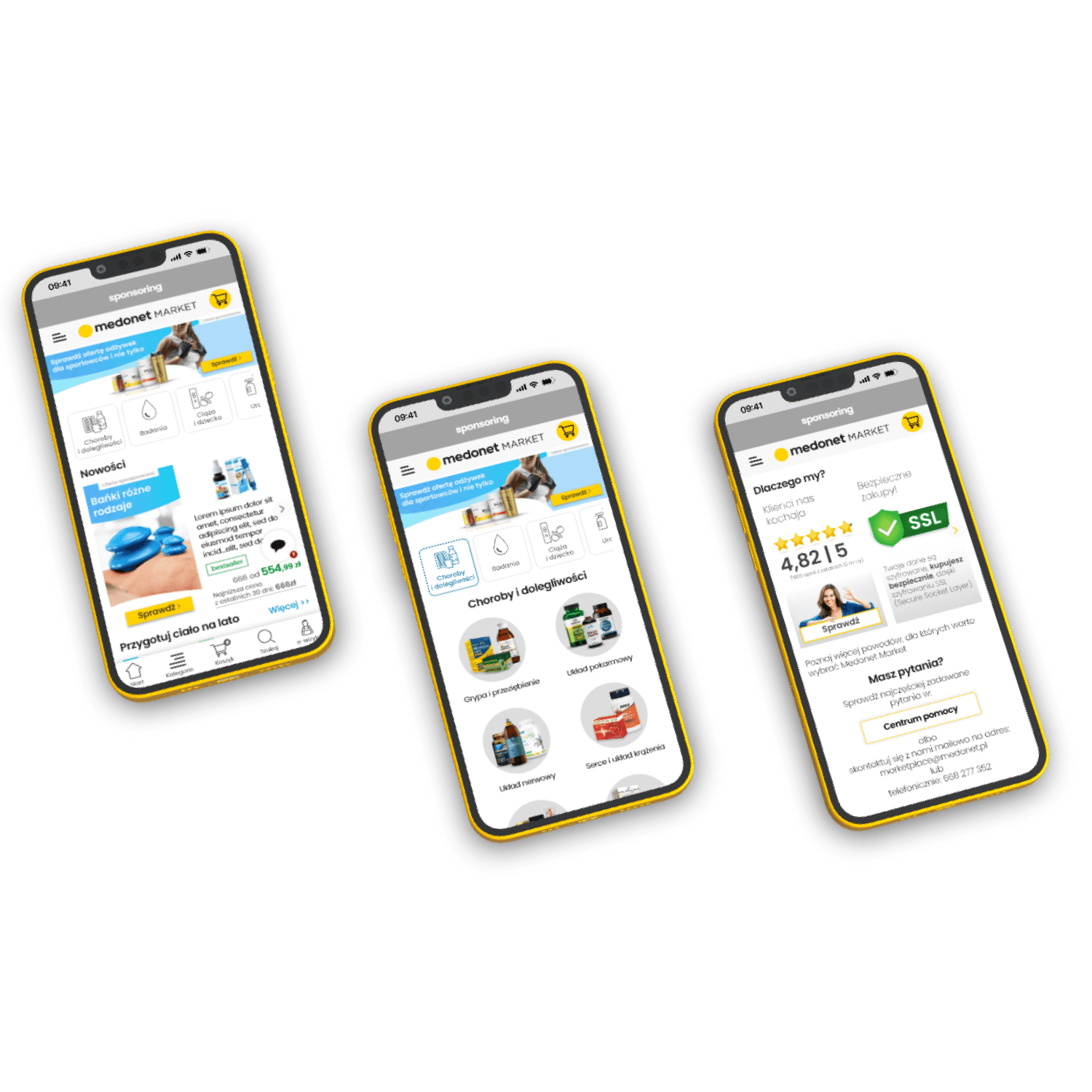
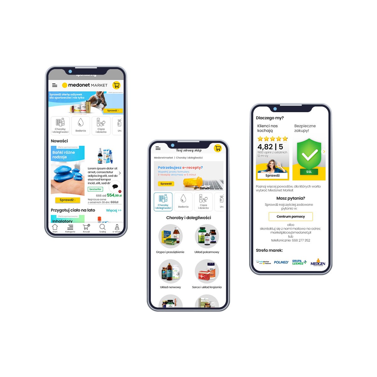
On the homepage, references to products available on the site appeared in the form of a banner, a visual navigation panel (supported by icons related to product categories), and an offer banner. Thanks to these solutions, the store gained a medical/pharmacy character, which also enhanced user trust. A new layout of the page was designed, in which product information was compressed, allowing the homepage to accommodate more than just one offer (as it was in the previous version).
The decision to make these changes was based on a prior user satisfaction survey, which highlighted the lack of distinctive features related to the store's profile.
Poor navigation makes it difficult for the user to move around the site and find the necessary information. If the menu is unclear, the layout of the page is chaotic, and the links are not readable, the user may struggle to locate desired content. This leads to disorientation and might prompt the user to leave the site.
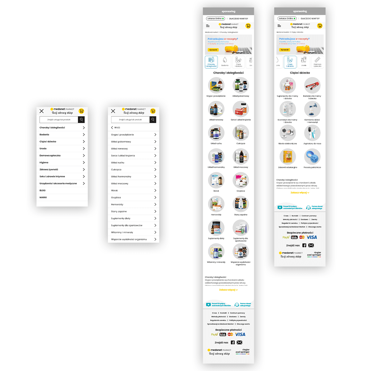
On medonetmarket.pl, a dual navigation system was introduced, including a classic "hamburger" menu and a "navigation panel". After analyzing the offers in the store, we, together with the team, determined the categories and subcategories that should be created, and based on sales analysis, we established the order/hierarchy of these categories. Following these analyses, the hamburger menu expands to show the category and subcategory tree, while in the navigation panel (additionally visualized with icons), a category and subcategory tree was created, utilizing not only icons but also product images related to specific subcategories. This approach aimed to facilitate user identification of what they can truly expect when clicking on a subcategory.
Marketing Issue. Every store utilizes pop-ups to notify customers about special promotions. Until now, once a closed pop-up disappeared, it wouldn't appear again, so the opportunity was lost once it was closed.
Together with the marketing department, we proposed a solution that would allow for a return to the special offer in the form of an icon that would reopen the offer:
Lack of consistency in graphical elements (banners) led to the main page appearing chaotic, requiring users to analyze each graphic anew, which made them lose significance, and the overall perception of the homepage suffered (Medonetmarket received individual graphics from its suppliers, and each supplier prepared these graphics differently, with varying styles, fonts, etc.).
The solution to this problem was to establish rules and consistency in designs, so that graphics wouldn't create confusion. Within these rules, I included constant elements that, despite changes, always had a shared component. These constant elements included: a Call to Action (consistent design, size, and placement), the effect of a wave transitioning from the left to the right banner (which changed over time), and text styles. Below, in the red frame, I present how this worked in practice:


