UX / UI / Research
Problem
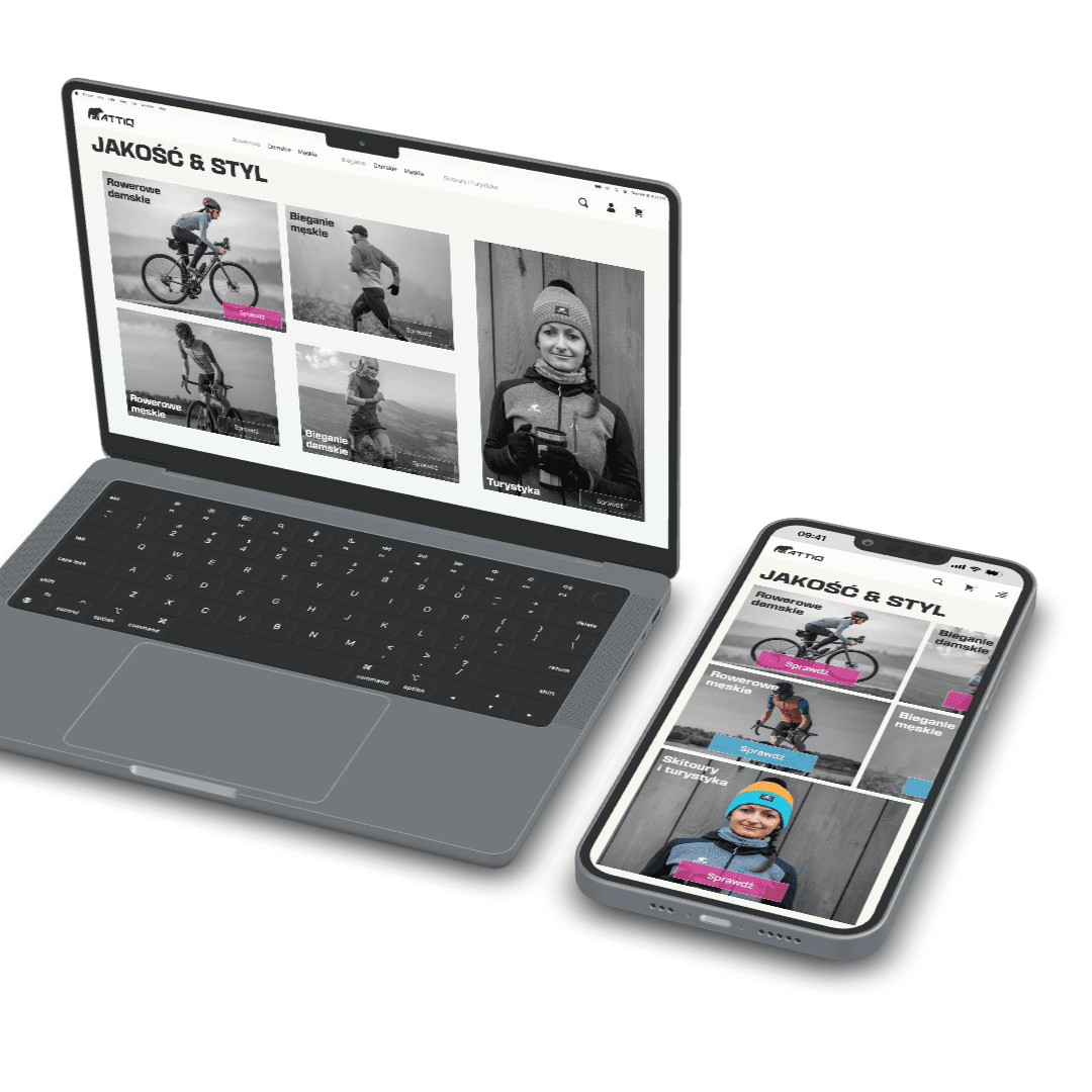
1. The homepage does not imply the content of the store.
The main page fails to clearly communicate what attiq.net actually sells. As a user, I am unsure whether it offers clothing, bicycles, or other accessories. The misleading copy that suggests "bicycles" as the product being sold further adds to the confusion.
How it is and how can be
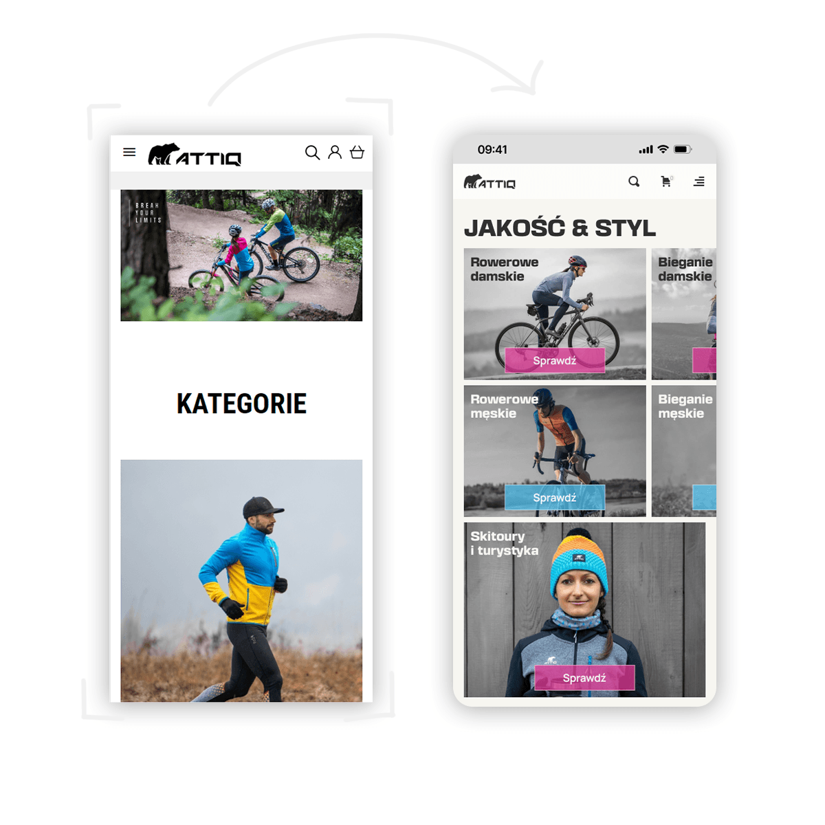
My solution focuses on greying out the content and leaving only the elements that the store actually offers in color. This approach allows the customer to immediately focus on those colorful elements, which subconsciously informs them about the products available in the store's offerings.
Features that can improve conversion and user interaction
Entry animation (simple Figma's animation, may be used but for example only for new users, when that appear every time u visit website can become annoying.)
Notice extra hover state that brings out the category you currently are on.
Before and after:
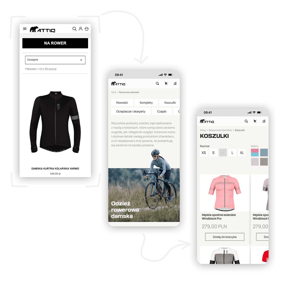
Limited category and subcategory filtering options.
If we are customers of the store and have navigated through the homepage, we should arrive at the category that interests us.
We should also have the option to narrow down our search so that we don't have to look for a single product among dozens or even hundreds of others. That's why, for an extensive category like "Women's Bicycles," I have added additional subcategories to solve this issue. The page of such a subcategory should provide us with options such as choosing the color or size. If the store has a small assortment, such an option may be unnecessary, but by focusing on continuous growth, it would greatly facilitate the search for the desired product in the future.
Before and after:
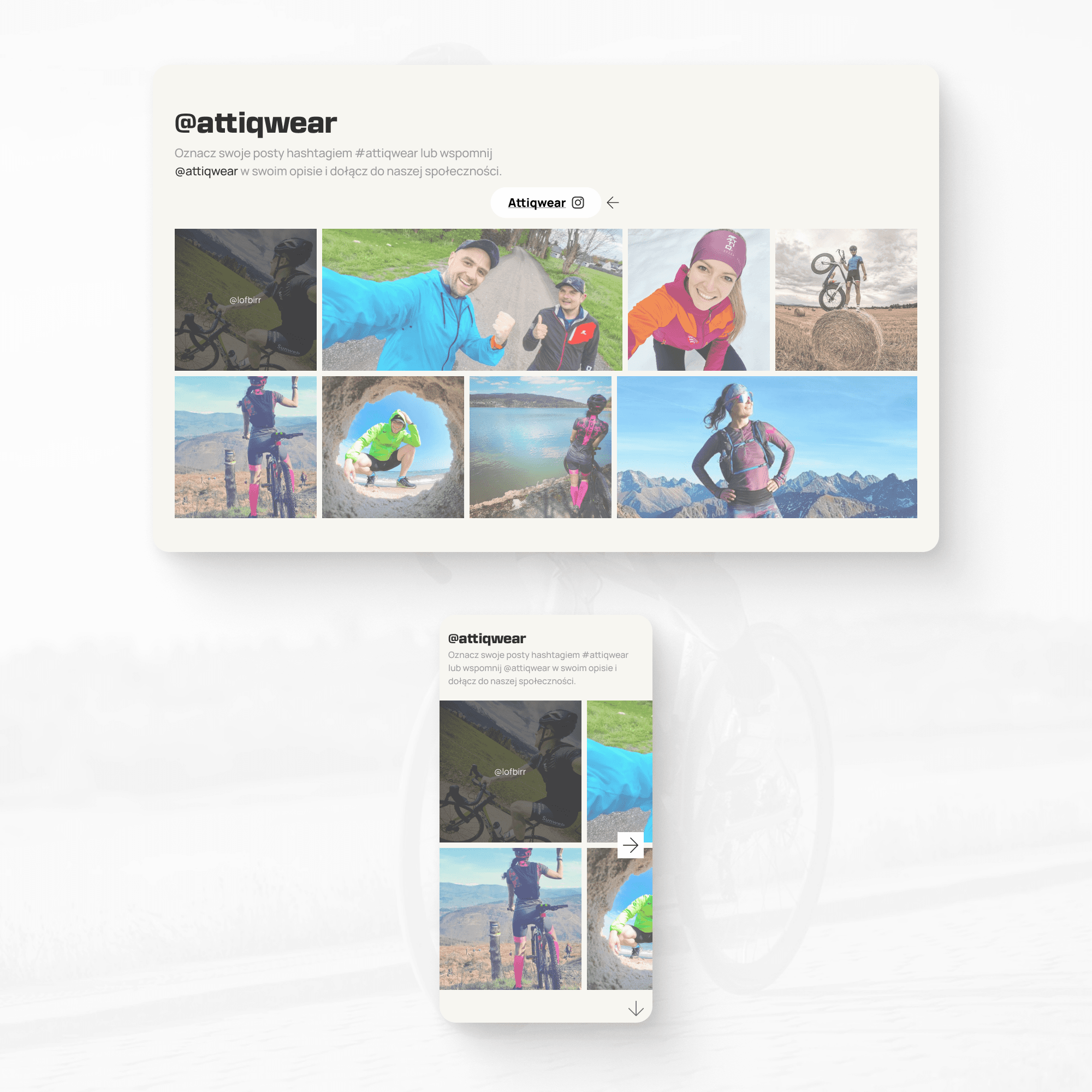
“Instagram proof”
I am a heavy user of social media myself, and I know how strongly they influence people and their purchasing decisions. As an additional motivation for purchases, a module with user-generated photos can be utilized, where users have tagged our brand on Instagram, with the promise that the best photos will be featured on our website and rewarded with, for example, a discount code.
Such an action results in:
Becoming a recognizable brand.
Motivating people to make purchases and tag us in their photos, thereby expanding awareness of our brand through buyers.
Potential buyers can see real photos on users, which further convinces them about the brand and encourages them to make a purchase.
An additional motivation for purchase and tagging can be the desire to be noticed by a narrow group of users for a particular product.
If you're interested in taking a look at the figma file, the link is provided below:
